CN
EN

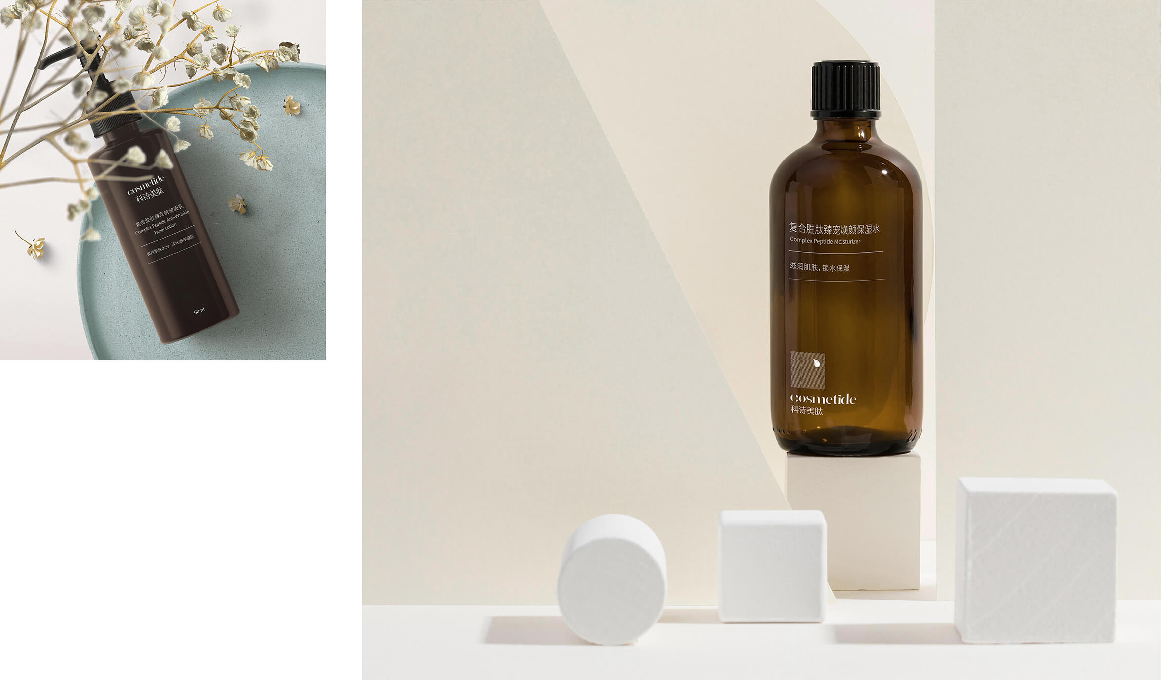
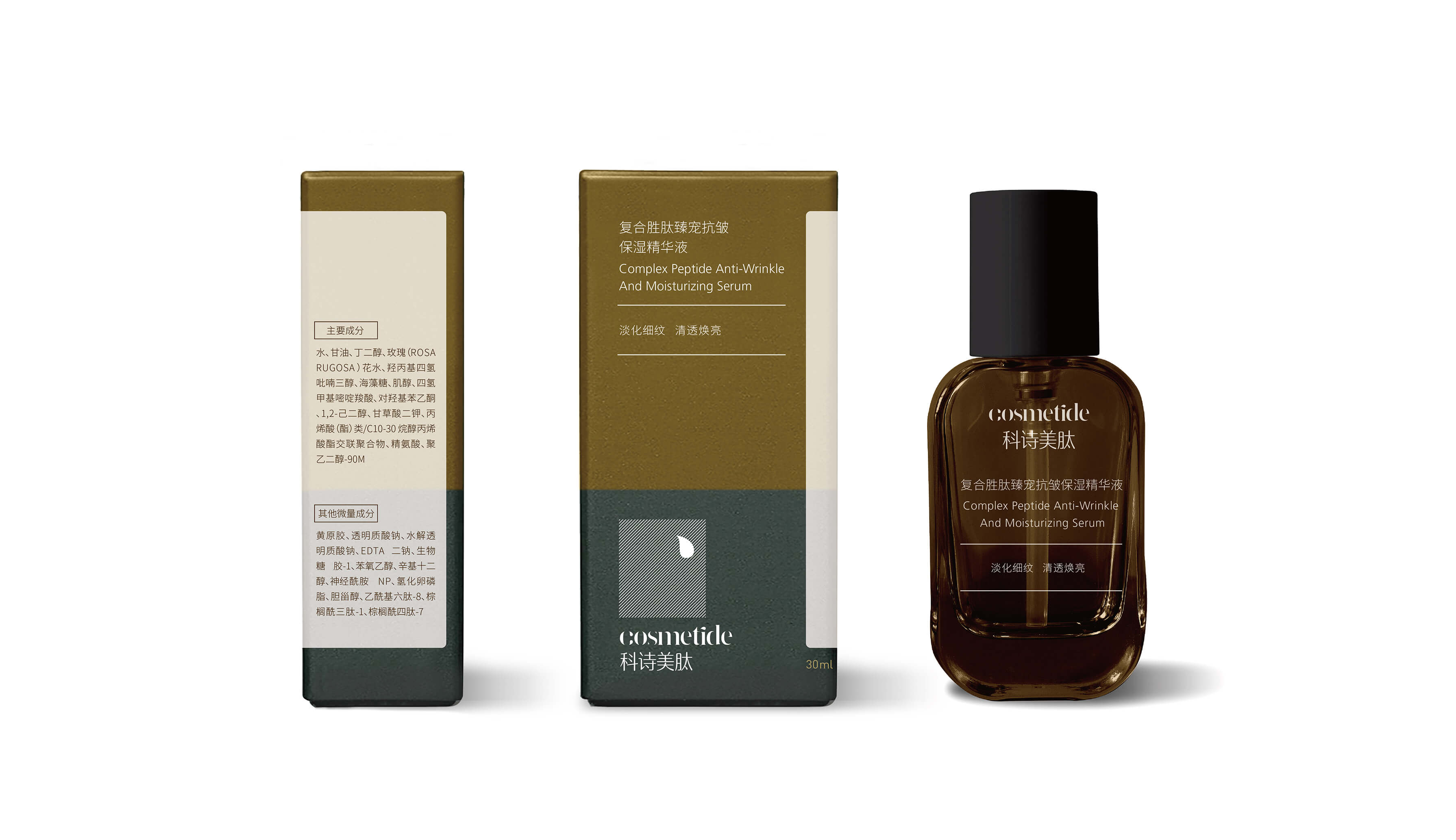
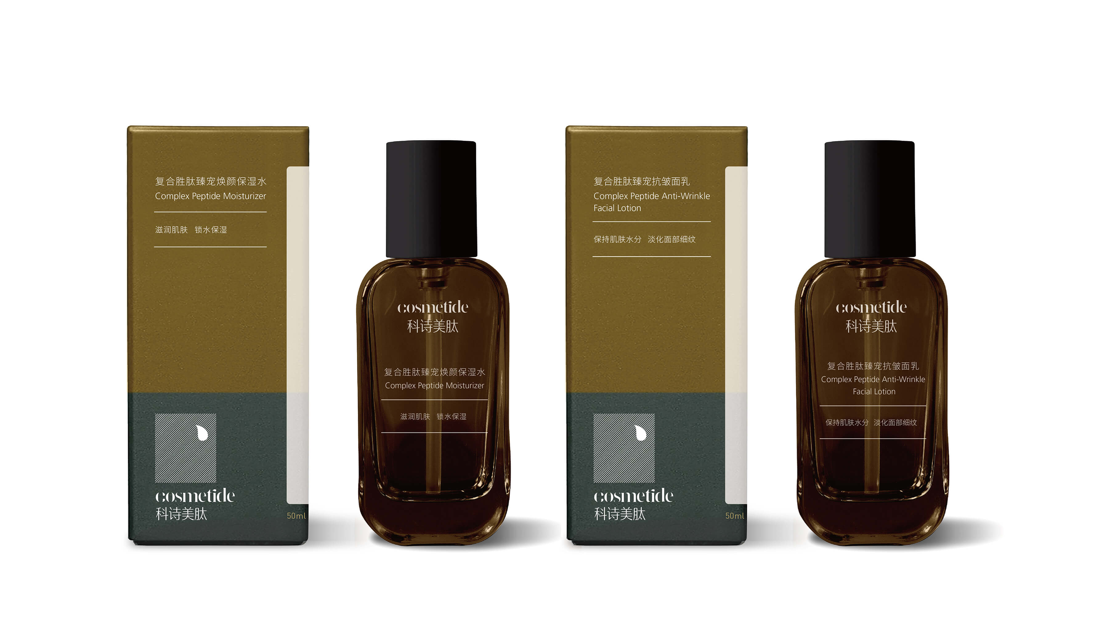
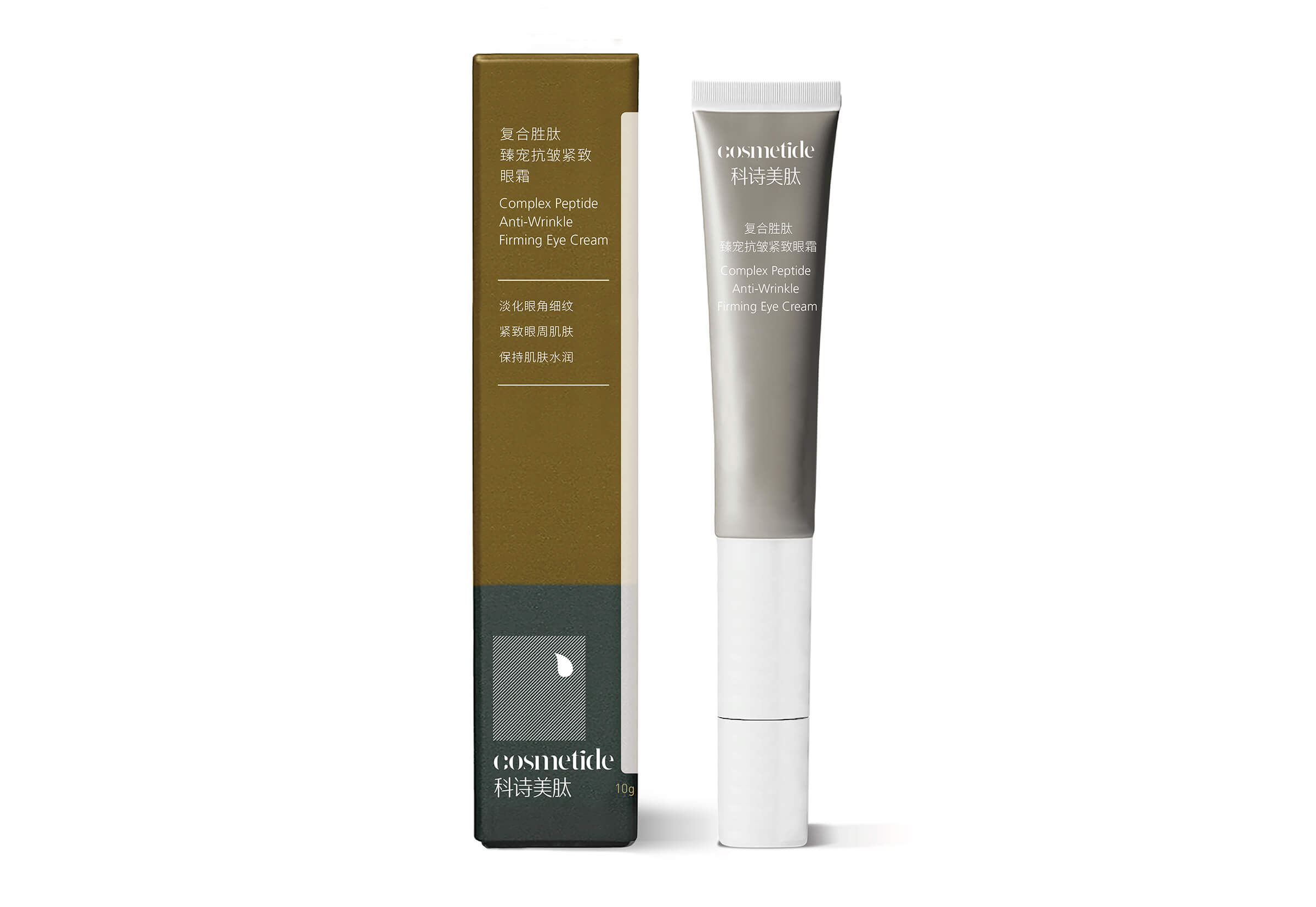
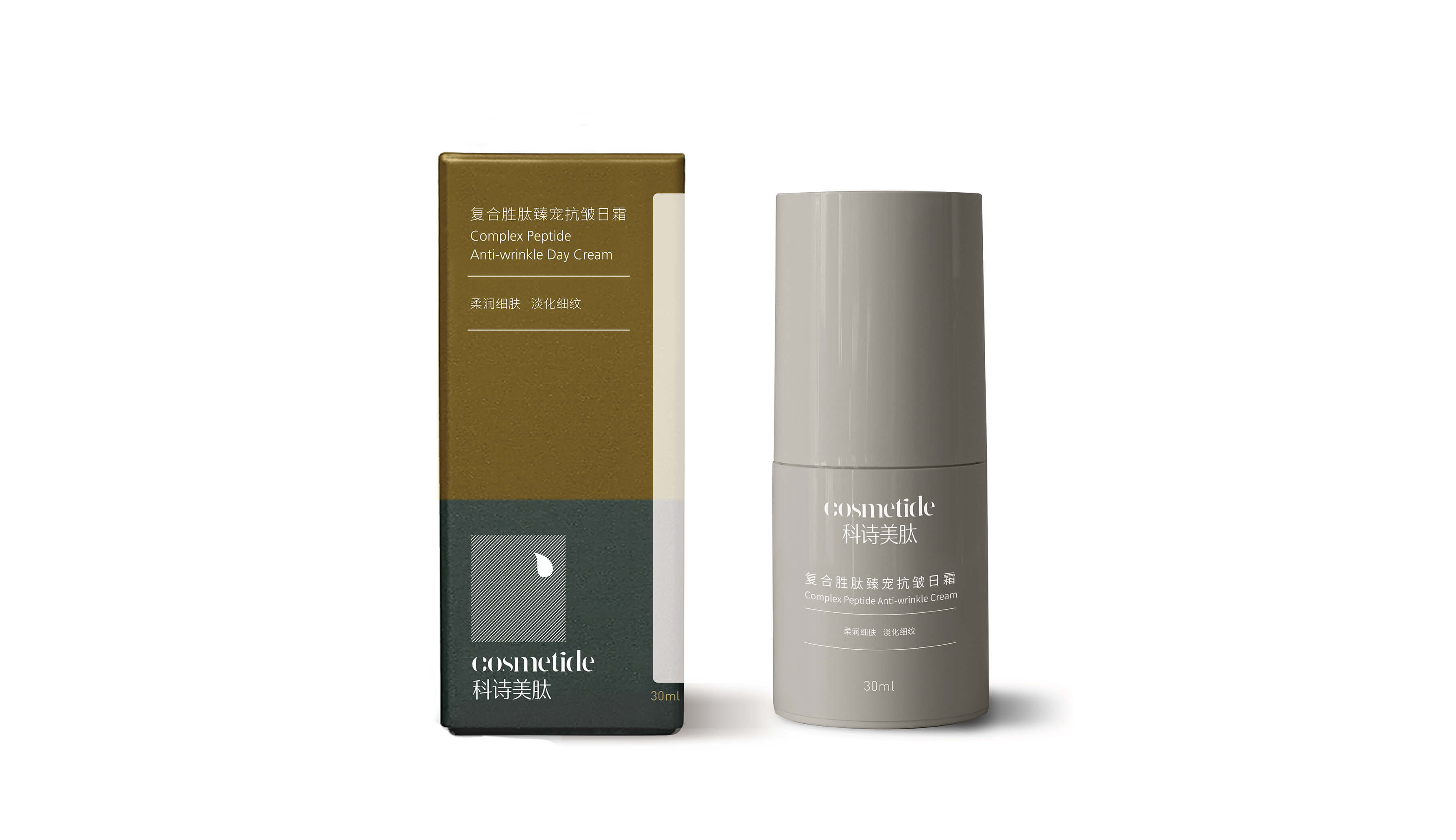
COSMETIDE
I was responsible for the visual identity and packaging design of this skincare brand. The logo follows a reductive
design approach, simplifying the letter “C” to its essential form, with only a liquid-like element retained to echo the
fluid nature of the product. Structured diagonal elements complete the visual surface, resulting in a minimal and
refined identity. The overall imagery conveys a subtle sense of contemporary Zen aesthetics, expressing a distinctive
Eastern brand sensibility.